Learn From Worst Design Practices
What really gets me excited as a user experience designer is when I have the opportunity to get in touch with the worst design practice products or services: I can really feel the essence of my job in transforming things for the better and changing the paradigm of people’s interaction with any everyday life product or service.
What actually comes to your mind when you hear or see the term “UX” (user experience)? Let’s take a simple example that we can all identify with: The walk to the bathroom.
Bathroom UX Part I
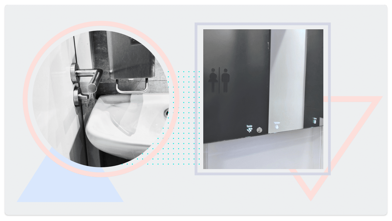
One time in Amsterdam, at the best pizza place in town, I was standing in a line in front of the bathroom with 4 other people. With one woman already inside, we were in total 6 people and none of us could open the door for about half a minute to get out of the bathroom (this explains the unnecessary long queue). When it was my turn, I experienced the challenge with the door myself. It was actually very easy to close the door, but to open it was very tricky. I had to do two things: to stick my hand between the sink and the handle, and to turn the lock back at the same time using only my fingers (I know it’s hard to imagine this, so I provide a picture below). This reminds me also of the great onboardings we take care of and the terrible offboardings we leave the user alone with – but this deserves a blog post on its own. After some panic and acrobatic moves, everybody managed to exit the bathroom, but unfortunately with a bad experience.
Bathroom UX Part II
On the other hand, I had an awesome bathroom experience at the Design Museum in London. The blend of style and usability deliver a perfect match and it’s a pleasure to use for visitors and even for cleaning staff to maintain and replenish. A behind-mirror solution provides the soap and the dryer directly over the water tap in front of the user. This shapes the overall museum experience into a satisfying well-designed user treatment.

I Wonder How Many Hours I Have Wasted On Bad User Experience
I’m not talking just about sanitary facilities here. These not-well-thought-through physical user experiences also reflect the user journeys in the digital world – the sphere that I am working in. Who didn’t notice the inconsistency of interfaces where sometimes desktop is coming from Mars and mobile from Venus. Friction reduces users’ satisfaction and my job is to minimize those flaws within the user journeys or leave no room for them during the new feature development. But quite often I seem to be the enemy of the company budgets. The relevance to invest in user experience design is still not comprehensible for everybody. Sometimes I wish I had a rocket ship to escape meetings where the requirements are almost perfectly laid out for business and poorly for users. So I’m trying to survive these day to day challenges that we are facing while working on complex problem-solving UX cases. After a couple of war stories and battle scars, I can reveal some of my survival maneuvers.
Now Users Have The Choice
I can expect that after the bathroom experience people won’t come back to the Amsterdam restaurant, no matter how good the pizza is. And believe me, people will also be more eager to talk about the bathroom problem than the tasty pizza afterwards.
In the digital world, once you have lost the users with a bad user experience, they won’t come back. It’s exactly like you definitely won’t go back to that bathroom where you almost stayed forever and check if they might have fixed the problem. You just go to the pizza place nearby with a trusted bathroom. Because it’s just easier and more comfortable and as a user, I have made exactly this choice.
Become The Trusted Choice
Online, all the alternative suppliers are just a Google search away. A single fingertip decides on a global competition level. Since users are swamped with all the choices, they spend less time evaluating each option and their tolerance for problems is shrinking. Time has become one of our most valuable resources. We are busy, stressed, and have little patience. Faced with an overwhelming amount of choices, we use the slightest imperfection to narrow down the field. Consumers always compare their current user experience to every other great user experience they have enjoyed so far.
And like always, it’s possible to give an Amazon example at this point. This company makes you easily spend more money on buying a washing machine than you would have (I am not the only living proof), only because you trust the super-fast checkout and the reliable return policy. You know that Amazon saves you time, effort and some nerves.
Now users have the choice. With choice comes power: Power to negotiate and power to expect more. Consumers also have a powerful voice and with this voice, they are making a huge impact on the digital world in both positive and negative directions and what mobilizes them is the user experience design!
Let’s Make The Pig Pretty
“Investing more money in better bathroom facilities of the Amsterdam pizzeria wouldn’t really help, but investing in the rearrangement would solve the problem.”
Most of the people think designers just make things pretty. As a result, designers are always brought into projects at the very last minute to put lipstick on the proverbial pig. Delivering a great user experience needs more than sprinkling “some pretty pixie dust on top of a crappy product.” – says Eric Reiss, UX Guru.
Our job is to uncover the problem-solving patterns already in the ideation stage, before a new product is built. In reality, products are often breaking down or growing out of control. And then, business thinks it is our job as user experience designers to build things on top of the product and rescue it somehow from drowning. This is usually the outcome when developers and product managers measured success by whether a product is shipped on time, and not whether the user experience design satisfied users’ needs. Please don’t let things slip through the cracks and have always the users in mind.
Let’s Sell The Benefits Of User Experience Design (UX)
So how can we convince the business to include us from the beginning? There are usually three groups of stakeholders: the business, the client, and the user. And there are two things the business and the client don’t like: additional work and change. Unfortunately, user experience design often requires both. The UX perspective has to fully understand and address the business goals of the client and address the user at the same time. To make both happy. Empathy is needed in both directions. The impact of the user experience on sales funnels cannot be overemphasized. If you make the lives of your users easier, they will spend more with you. It is that simple.
Wow! The outcome looks so simple!
It shouldn’t have been so difficult, huh?” But it is mostly the other way around. The more simple it looks like for the user, the more effort was behind it (props to my colleague who explained this on point in his blogpost). Analyzing the market environment, comparing and benchmarking other solutions, creating prototypes. Testing. Learning. Improving. This takes time. But, in the end, it will save time and money because you will be able to design the right solution from the beginning, rather than having to adjust further down the line when the cost of the change is more expensive and you need to put lipstick on the pig again.
If you just think about some fundamental requirements for your products’ experience, instead of slaughtering the pig, you will be creating a beautiful unicorn from the very beginning.
Certain UX methods can have a big impact on creating your beautiful unicorn: testing, feedback, inclusive design, and identifying the situational context.
Testing
Bringing garden tools to the mass market that are difficult to use with gloves or when the hands are wet is a painful failure. It is indispensable to test early with prototypes to catch and fix problems through an iterative usability testing procedure. A user feedback process helps with gathering, discussing and rating the feedback from different sources, to make sure that you are first implementing the most valuable features for the user. I also highly recommend internal user testing within your company as it delivers you fast feedback and you can test different versions with low fidelity prototypes to discover in which direction you have to proceed with your design concept. Based on the “Dogfooding” principle, product creators have to be the first to experience their very own products in all use cases. Did I mention how important testing is? It would save this company a lot of bad reviews and unhappy users, not to mention the money.
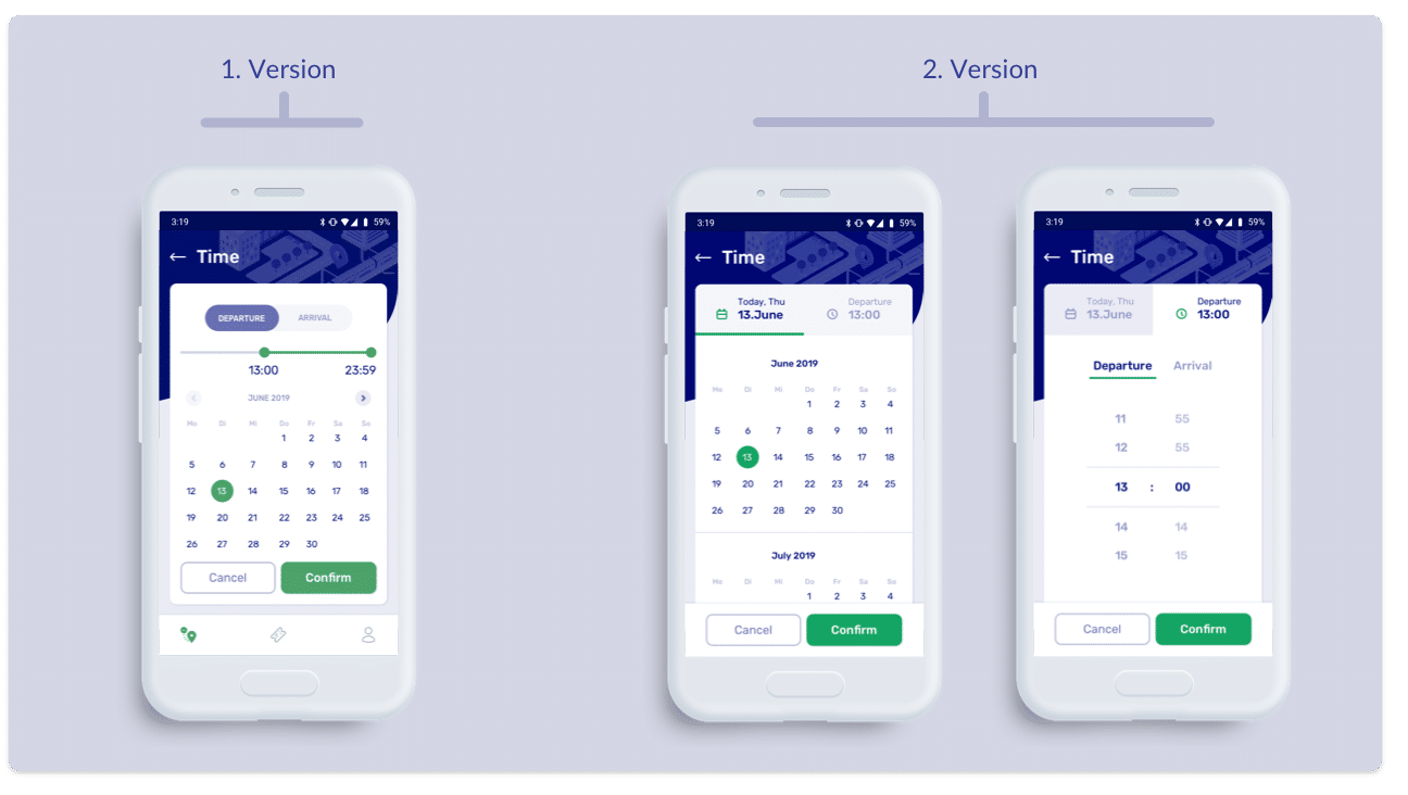
The following example shows a makeover after a tested date and time picker screen. The design team was deeply convinced that the Version 1 is already bulletproof and ready to be implemented. But the user testing showed that the screen is overwhelming the user and the fancy slider was declined by almost everybody. Version 2 solved this issue with two separate screens and different patterns.

Feedback
The next challenge is making the outcome of the testing feedback easy to understand and concise for all the stakeholders. It should be explained not as a list of problems or issues, but rather as opportunities for improvement. Creating assumptions for design improvements based on known principles and patterns could be helpful to understand the efficiency of the changes. A simple example like: avoiding a registration for using your product will increase the number of app users by 40%. Validating these assumptions through your data outcomes and research can reduce the risk very early in the product development lifecycle, before the business has made any significant investment in a design solution. Play the “Saving time and money” card and show your stakeholders the quick wins. When the business sees tangible results at a small cost, you’re in a better position to sell UX improvements based on a test with real users. This ensures the user-centered experience outcomes.
Inclusive Design
As we become driven by digital, considering the accessibility of all user groups is turning out to be more important. Something as simple as green text on a red button could completely ruin a color-blind user’s experience and result in a lost sale or lead. Also, minimal contrast ratio and text sizes should always be taken into consideration for users who have a visual impairment. This and even more interesting insights I got from the UX Cambridge Conference I attended at the end of 2018. It was one of the big topics which was highlighted by the speakers and the UX research communities.
Inclusive Design helps us create products that serve as many people as possible. While accessibility is a core objective, inclusion means much more. It enables people with diverse characteristics to use a product in a variety of different environments. It’s important – especially when designing for millions of people – to create different ways to participate in an experience. It is a win-win for customers and businesses. It expands the product’s reach, sparks innovation, and helps your company take on a position of social responsibility.
“Every design decision has the potential to include or exclude users. Inclusive design emphasizes the contribution to include as many people as possible. Human diversity covers variation in capabilities, needs, aspirations, and origin”.
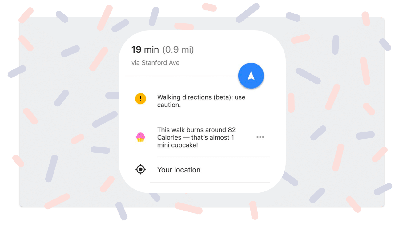
One day Google Maps brought a new feature into life. As soon as the user draws a walking route, Google tells you how many calories you will burn with a comparison to the number of cupcakes. WTF? First, this is extremely triggering if people had/have eating disorders. Also, the “calorie estimates” take nothing about your health into account so they are just wildly inaccurate. And why are mini cupcakes the unit of measurement? Pink cupcakes are definitely not neutral – they have social and cultural encoding: feminine, white, middle class. A useless feature which perpetuates this toxic diet culture. Oh, wait! Did I tell you that there is no way to turn it off?

Identify Situational Context
UX always has to merge with the environment. There are no consistency rules. You need to find a method that serves the users in their unique circumstances. Using bright and flashy colors for a taxi app in always rainy and grey London might have a big impact on the user experience. You can’t find this in any popular UX definitions or books. You have to consider the context in which the user is interacting and discover the moments where you can make your product shine.
I had always been incredibly interested in different kind of people
Now I am creating their experiences on digital interfaces. If you are working in UX, with time you are becoming more and more passionate about delivering seamless and outstanding user journeys for your products and services. You put yourself in other persons’ shoes and start to feed the demands of today’s pampered users. YOU are one of these users and you are especially pampered by your own research and knowledge about the best possible UX paths. Out of empathy with others, I am always fully dedicated to the best possible outcome for us, the users.
Irina
Irina, UX Designer at Mobilab.