
As generative AI moves from experimentation to everyday use, more organizations are integrating it into their products to accelerate software development. In this article, we explore how a robust design system, backed by a well-structured token system, provides a reliable and scalable foundation for delivering high-quality digital products faster and more consistently.
According to Gartner, by 2026, 80% of organizations will be using generative AI in production: a huge jump from under 5% in 2023. It’s becoming fundamental to how organizations build and iterate their products, especially in the race to deliver faster and to stay competitive.
But speed alone isn’t enough. Great user experiences are just as crucial for long-term success. A product can only thrive if users embrace it. And while that may sound obvious, it’s often difficult to get it right.
One of the most effective ways to close this gap between velocity and quality is through a strong design system, backed by a well-structured token system. Together, they enable scalability, consistency, and speed, while ensuring products feel and behave exactly as intended.
Design systems have become the backbone of scalable and efficient product development. At the heart of nearly all modern design systems, there’s a token system: a way to store and apply design decisions—like colors, fonts, and spacing—in the most efficient and error-free way.
Many teams across the industry have reported that a well-structured token system can save 30–50% of design and development time, compared to workflows without one. Based on our latest experiences, we can confidently support these numbers.
At MobiLab, we have been determined to build a new, more robust token system that could level up our “White Label Solution” Design System (Pillars). While our previous setup served us well, it didn’t provide contextual meaning to our design decisions. The complexity and velocity of customer projects called for a more meaningful, scalable approach.
By introducing a new system based on component tokens (which I will explain shortly), we aimed to:
- Simplify decision-making.
- Speed up the delivery of components and interfaces.
- Ensure a more cohesive design language across projects.
In this article, I’ll share why we’ve made this shift, how this new system empowered designers and developers to work faster and smarter, and more importantly, how our customers reaped the benefits.
A Continuation of Our Journey Into Design Systems
Following up on our latest article about how we created and are currently steering our evolving design system, one can say that we now have a good structure in Pillars (our Design System), containing many components and patterns that have been supplying our projects very well.
Here are two examples of components we have published—our Alert and Button components—fully documented and ready to be used across any project:
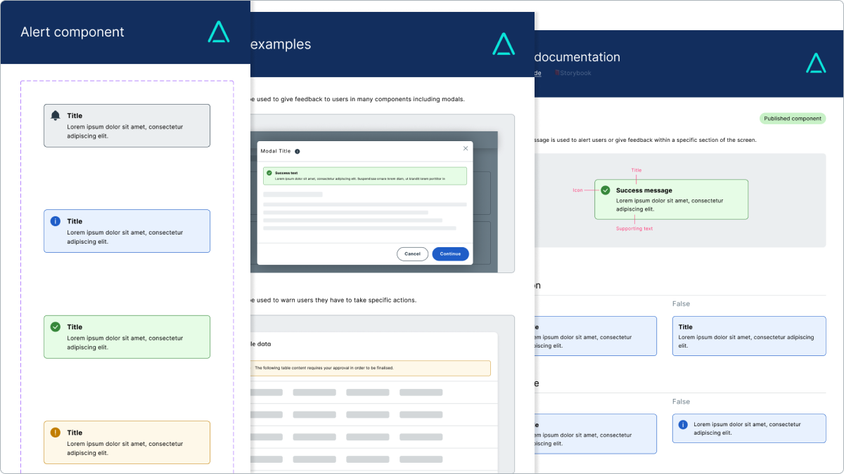
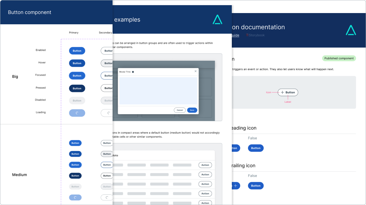
Making our Design System a living product is a key principle we’ve been following since we started assembling it. Learning from different customer experiences and the new market trends and needs, we not only supply Pillars with new components but also continuously adapt and evolve the ones we have in place.
For our team, the next step ahead in this process was extremely clear: to reduce the number of decisions we have to make when re-using the components on different customer projects and make the remaining ones error-free. There wasn’t any better way to achieve this than leveling up our current token system.
Let’s explore how we addressed it.
Tokens - The Building Blocks of Modern Design Systems
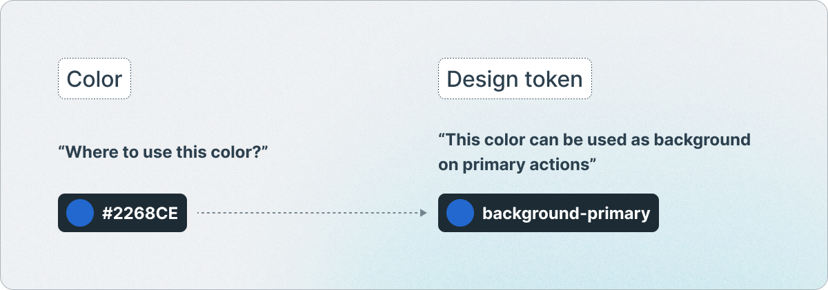
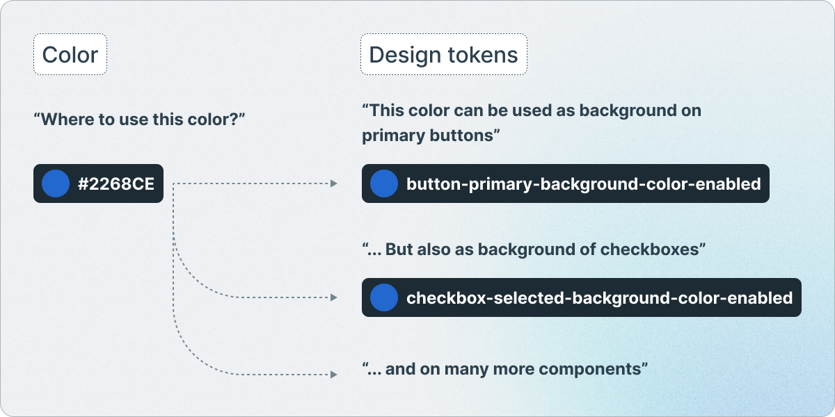
Design tokens are, in summary, comprehensive names that capture design decisions, representing key visual and functional attributes such as colors, typography, spacing, interactive states, and much more. If someone on the team asks which color to use for a button or a space between 2 elements, the tokens will give that answer instantly.
They can be more abstract and encompass multiple decisions in a single token:
Or more specific and address precise component decisions:
Tokens are used as a shared language between design and development, detailing key information on how to build everything that will be implemented in a product, in a data format (such as a JSON string). They are the building blocks of modern design systems.
Here’s an example of an actual code implementation of some tokens for color:

They can be categorized into three types:
Primitive tokens
The most basic form of tokens. They store raw values, such as colors, font sizes, spacing units, and other fundamental properties. For example, the color-primary-A500 represents the value #2268CE and spacing-s represents the value 16px. Primitive tokens are used to define the foundational styles of a system. However, they don’t provide context, which means they often need to be mapped to higher-level tokens for meaningful application (one of the next categories).
Semantic tokens
Built on primitive tokens, they provide context and meaning to them. They represent functional roles in the design system and align with the purpose or intent behind a style (such as color). They describe what a token does rather than what it is. For example color-background-primary maps to color-primary-A500.
Component tokens
Specific for each component, they also provide context and meaning to decisions for that component alone. They can be mapped to either primitive tokens, semantic tokens, or both. For example, pillars-button-primary-background-color-enabled maps to #2268CE, to color-primary-A500, or both.
Here’s how they stack up, layer by layer, like a cake:
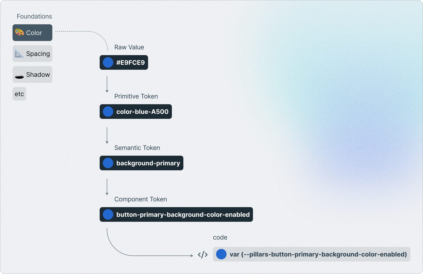
Design Tokens Accelerate Customization of Styles
Streamlining and accelerating
Salesforce initially introduced design tokens to streamline the process of updating designs across multiple platforms. Tokens make it possible for a design system to have a single source of truth: a repository where style choices are recorded and changes can be tracked. In our White Label Design System, where multiple customer projects share the same foundational framework, some level of customization is still required for each project. Design tokens streamline this process by enabling a seamless transition from our default white-label solution to the client’s unique brand and visual identity.
Here’s how this transition looks for a button component:
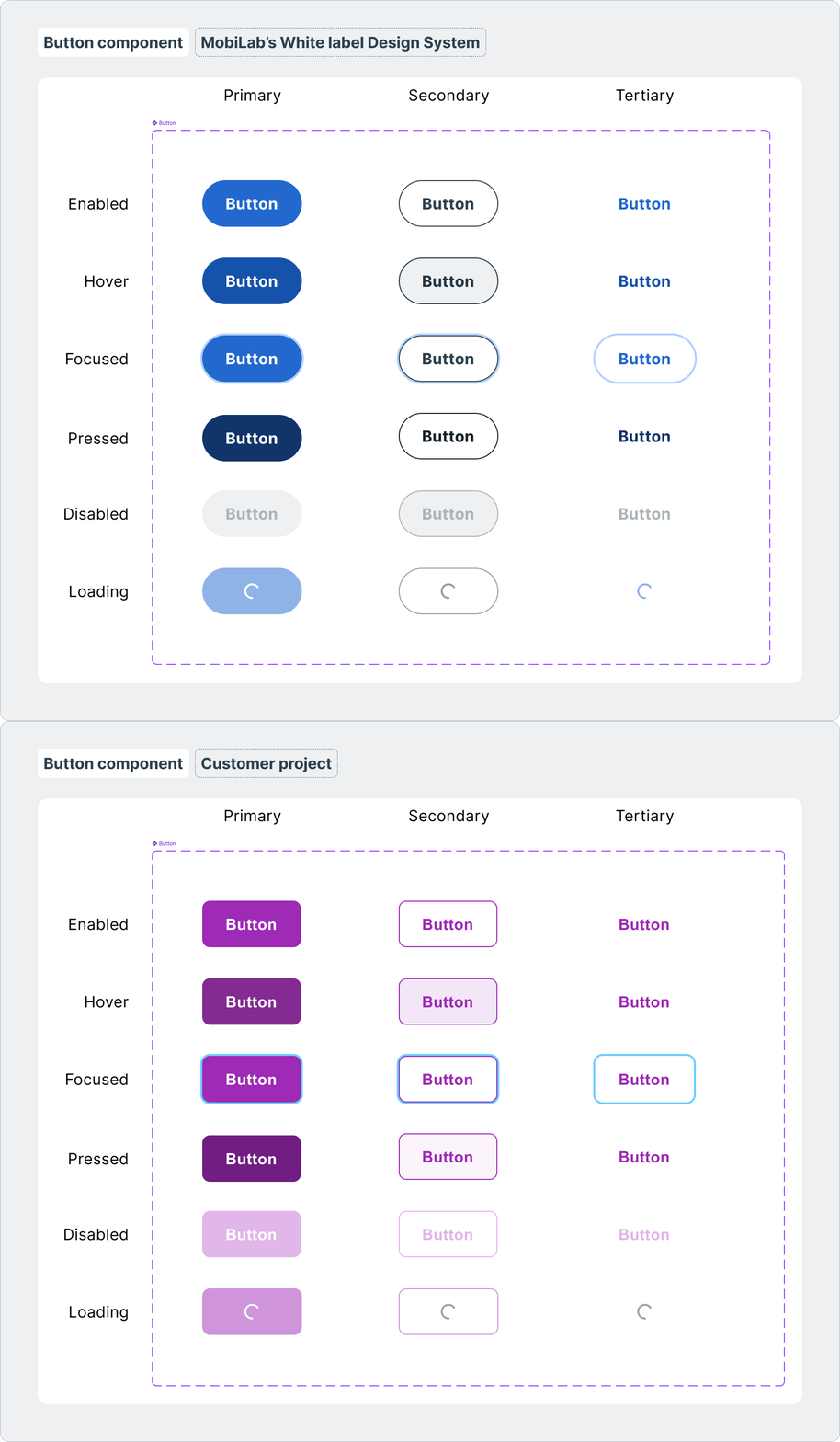
By simply updating the raw values of the styles at the start of the project, this infrastructure accelerates the entire process by up to 50%, if we compare it to a design system without a proper token structure, as mentioned earlier. This is a huge deal since this is in direct relation to how much budget our customers will save on the development efforts.
Good design as a key part of a good product
At MobiLab, we believe in good design and excellent UX as the glue that holds together business, users, and technology. This exercise, which is far from being a simple one, compiles many different aspects of the overall user experience with a product or service. One fundamental is the emotional connection of a user to a brand. Integrating a customer’s brand into a product isn’t just a design choice; it’s a strategic move that enhances user experience, builds trust, and strengthens brand loyalty, so we need to make sure we do it right.
At the same time, the good design and usability principles that are present in our white-label components, such as accessibility, contrast, and simplicity, will automatically transition to customer projects.
The Evolution of Our Token Strategy
The old token system: A simple approach with primitive tokens
Following an iterative software mindset, when we first released Pillars, we did it with a simplified version of a token system, based on primitive tokens only, just so we could expand it later on. This is where all teams start in the token world.
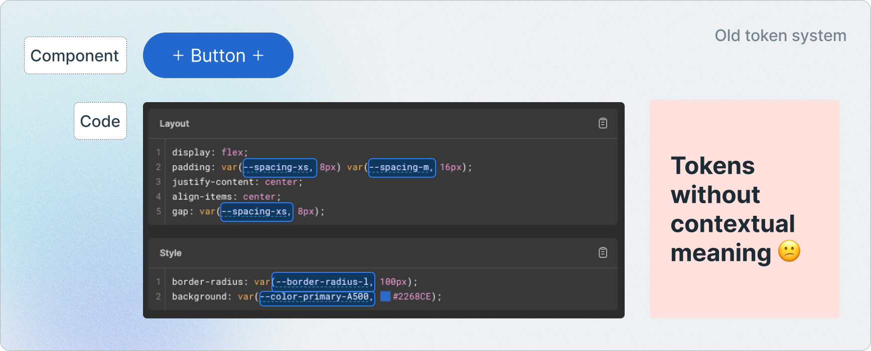
This step was still very useful as a semantic approach to tokens always requires the primitives to be set beforehand. At the same time, it allowed our team to use these and ship high-quality products with them while saving some effort compared to a design system without any tokens at all.
The new token system: A meaningful token system for Pillars
Moving into a meaningful and contextual system would let tokens clearly state their purpose. If a certain token has a clear meaning behind its name, and that is comprehensive enough for the team members that will be using it, the room for misusage would be close to none.
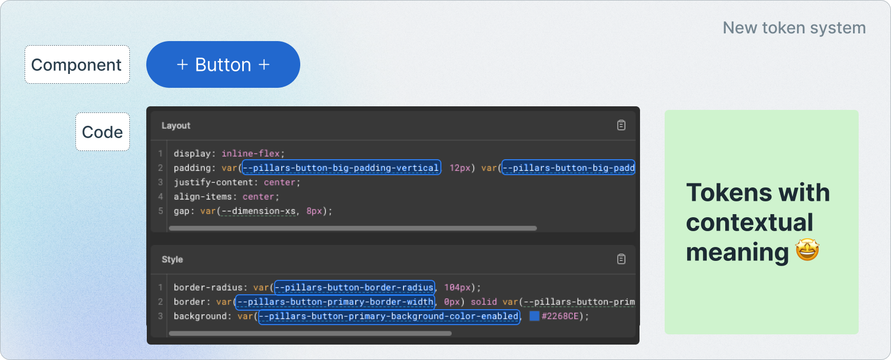
Today, the tokens we use are specified for the components we have. They are all contextual for the purpose they serve, and that is written on their names. For example, pillars-button-border-radius have the single purpose of stating which border-radius buttons will have. It won’t be used anywhere else, nor will it change throughout the development efforts.
This approach was replicated for all styles of the components we have in the Design System. For buttons alone, we have more than 90 design tokens, considering the different styles of the variants and states we currently have in place.
Automation and scalability as core principles
As design system experts and advocates, we knew one thing or two about the possible choices we had at hand. All design systems are different, including the way the tokens are named and organized. All of these design systems out there have different purposes and needs: some are multi-brand, some are not; some are brandless, some are not; the naming and amount of the primitives differ a lot, and so on. All of these factors play an essential role in the token structure.
Considering our latest customer project experiences and the needs they required, our guiding star was always one: the concept of “white label”—the key advantage of our Design System—that working as a framework would allow us to use and reuse our solution multiple times for different brands, with their own shapes, styles and voice.
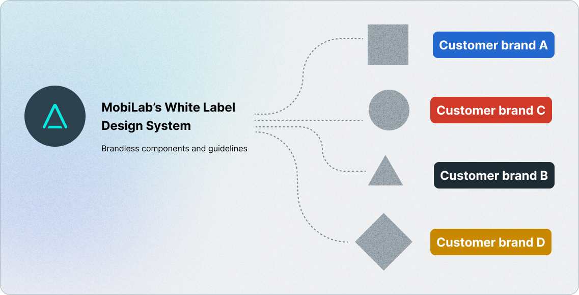
Build once, automate always
Paraphrasing Kristina, one of our Managing Directors, “At MobiLab we only build things once, then we automate”. Automation isn’t just a practice: it’s a core principle that runs across our entire company. It’s in our Design System work and is deeply embedded in our team’s mindset. It’s present not only for the components’ code, which will be re-used in every new project, but also for our decision-making process to implement all styles and functional attributes. The acceleration that automation brings is fundamental in meeting the short delivery timelines we commit to with our customers.
How Organizations Can Benefit From a State-of-The-Art Token System
5 key advantages
1 – Revamp at lightning speed
Instead of modifying styles across multiple files or components, tokens are updated only once in the source file, and changes automatically propagate across all UI elements. This reduces the effort time drastically, as only a minor part of the work needs to be done manually.
2- Baked in from day one
From the very start of a project, our design system and token structure are seamlessly integrated into development. As soon as we receive the customer’s brand specifications, our white-label solution can immediately be adapted to the new project at hand. With the reduced onboarding time, brand consistency starts from the first commit.
3 – Technology agnostic
Tokens are platform-agnostic and are defined in a universal format (such as JSON) that can be easily used in web applications, mobile apps, and even cross-platform frameworks. This approach enables our customers to scale their products freely without compromising design consistency or being tied to a specific tech stack.
For example, if a customer is using React for their web app and Swift for their iOS app, the same tokens can be used, ensuring that both platforms look and feel identical without duplicated effort.
4 – Built for growth & extensibility
Modern digital products change fast and are constantly demanding an increasing number of components to fulfill their needs. We are aware of that, and that’s why our token system is designed to scale. The components are built with an atomic approach, which essentially means that they are formed by small reusable particles—atoms, molecules, organisms—that are shared across all of our component spectrum.
Whenever we need to add new components to the customer projects we are working on, this approach is used as an accelerator. These new components will also be using not only the pre-built building blocks, but also the token structure we have in place. It also enables sustained growth: as the product evolves, the design system grows with it, instead of needing frequent reworks.
5 – Seamless adoption, even without a design system
Our token system doesn’t require our customers to have a fully established design system to take advantage of its benefits. We handle the conversion of the customer’s brand identity—colors, typography, spacing, and more—into our structured token system.
What’s Next: AI-Driven Design With A Human Touch
Shaping AI products with trust, emotion, and good design
As we keep extending Pillars with more and more components, there’s a clear market shift towards AI-related products, from chatbots and virtual assistants to full-fledged AI analytics platforms. The list is growing by the month. At MobiLab, we have made AI-related components our top priority for Pillars. We’ve been at the top of the wave, building AI-powered solutions for our customers and seamlessly integrating AI into our built-in products, as showcased below.
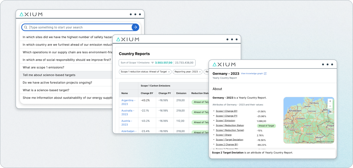
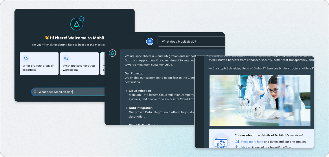
Designing trust in the age of AI
While the market gets flooded with new AI products, some user groups might be skeptical about whether they can truly trust and use them like they would usually do with human-centered ones. Designers and researchers of AI often notice a pattern: users may quickly embrace a tool like a scheduling assistant, but remain uncomfortable when the same technology is used for more sensitive tasks, like making hiring decisions or handling personal data.
The feeling of interacting with a machine, rather than a human-centered product, is becoming more pronounced. A certain degree of AI Stigma will likely persist for some time for many. Quoting the UX pioneer, Dr. Jakob Nielsen, “Gaining user trust requires addressing both the functional reliability and the psychological comfort”.
This principle has become especially relevant in the age of AI, where the emotional layer of user experience is just as important as the technical one.
A great way to prevent users from feeling disconnected or doubtful is to ensure we “speak human” and add a personal touch to the AI products we build. Humans naturally seek emotional connections, and great design taps into this instinct to create meaningful, engaging, and user-friendly experiences. This emotional bond can be strengthened through careful design principles and personalized interactions, making it clear that a product is not just functional but also an extension of a brand’s identity and voice. This is exactly what our new token system enables: it helps our customers maintain consistent, human-centered products through the power of branding.
Vasco
Vasco is a senior UX Designer at MobiLab, working from discovery to the delivery phase of software development projects.